H&M vs Zara: Global E-Business Assignment Help For University of Hertfordshire (Sample Work)
- 19 November 2024
- Posted by: OAH
- Category: Business & Management

This is a sample assignment on Global E-Business, created for University of Hertfordshire students. It analyzes customer journeys on two leading e-business platforms, H&M and Zara, focusing on user experience, website design, and checkout efficiency. The assignment report also proposes a hybrid e-business model that can help enhance customer satisfaction and business performance overall by utilizing the best of the features from the two e-commerce websites.
This sample will also help to understand the high-quality assignment help we provide to students.
If you are also from the University of Hertfordshire and looking for assignment help in any module including Global e-Business, then please contact us today and get the best assignment help at affordable prices.
Get Affordable Assignment Help Online. Contact us!
Analyzing Customer Journeys: E-Business Solutions for H&M and Zara | University of Hertfordshire
Assignment Question:
Analyze and compare the customer journeys of two global e-business platforms, H&M and Zara. Propose strategies to improve user experience and business performance based on your findings.
Module Name: Global e-Business
Global E-Business Solutions: H&M vs. Zara Case Study Sample
Table of Contents
Introduction
This report has been developed to examine the customer journey of two big apparel retail e-businesses at various stages. Its goal is to compare and contrast the characteristics utilized by two eCommerce organizations that influence the customer experience at various phases of the customer journey proposed by (Mangiaracina, 2008), leading to buy and retention decisions.
H&M and ZARA, both of which sell retail clothes, designer clothing, and fashion accessories to consumers, were chosen for the completion of this research.
A new e-business in the apparel industry has also been presented as part of the report, which incorporates the beneficial qualities and elements of both of the e-businesses under consideration. Customer demand and search, product discovery, product presentation, cart management, and checkout are all part of the report’s cycle.
Methodology
H&M and ZARA were chosen for this study because they are in the same category and sell similar products, but their designs, structures, and approaches are significantly different. H&M is a Swedish global clothing retailer with headquarters in Stockholm. It is famous for its fast-fashion clothing for men, women, youth, and children. As of November 2019, H&M employs 126,000 full-time equivalent people in 74 countries, with over 5,000 stores operating under several business names (Sheikh Salman, 2018).
While ZARA is a Spanish clothing retailer headquartered in Galicia. It provides different types of clothing and fashion products like designer clothes, swimwear, perfumes, wallets, and purses, which are among the company’s fast fashion offerings. It is the largest company inside the Inditex group, which is the largest apparel retailer in the world (Abdel-Jaber, 2021).
Similar products were purchased from both online apparel firms to examine the different steps involved in the customer journey through first-hand experience. Several aspects of the respective websites have also been thoroughly analyzed to generate useful observations and necessary findings.
Main Findings
Customer Need and Landing Page
The customer profile used here is of a 25-year-old girl who is looking to buy a pair of jeans for herself which should be in line with the latest trend. The motive for shopping online is that she wants to get an original quality product without consuming much time in browsing or searching at offline stores. Being a student, she doesn’t have access to a large number of funds so if she can save some money via a discount or promotional coupons then she will appreciate it.
She is already aware of both H&M and ZARA being reputable brands because of the brand awareness that fashion brands create through different channels (Chen, 2021). She directly typed the name of the two websites on separate tabs of the internet browser and the first organic link that appeared was of the respective websites. This tells that the website was properly optimized for the search engines to view appropriate results (Lewandowski, 2021).
A noticeable difference between the search results of the two websites was that H&M was also making use of Google AdWords to appear before the organic results (Figure 1), However, no such paid promotion on Google AdWords was discovered for the ZARA website during the research.
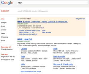
Figure 1: Search results for H&M consisting of results from Google AdWords
The customer opened the websites of both e-commerce companies on separate tabs to have a first view of their home page.
The website of H&M manually asks the user to select the location for which they want to do the shopping (Figure 2). This also could be understood as a way of creating a perception in the customer’s mind of how big and valued the company is on a global scale (Kim, 2020). ZARA website on the other hand was asking the user to allow permission to detect the location so that the system can automatically show the relevant results.
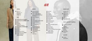
Figure 2: H&M website asking the user to select location
The landing page of H&M made use of different colors on a plain white background to showcase different messages and information (Figure 3). It also showcased some offers that the website was currently to attract the customer’s attention. Offers and sales are common ways that eCommerce website adopts to promote their businesses online (Ning, 2021). Whereas, the landing page of ZARA consisted of all the elements in just black and white color (Figure 4). There was just one image on the website clicked by a celebrity photographer for highlighting the exclusive collection of ZARA and the website very quickly came to an end while scrolling with social media links at the bottom.
The navigation on the H&M website was clean and easy to use on all the pages, but the website of ZARA had an encapsulated button menu on the left top which consisted of different categories. Because of this design structure, it was comparatively difficult for the users to understand the website content and structure of different pages.
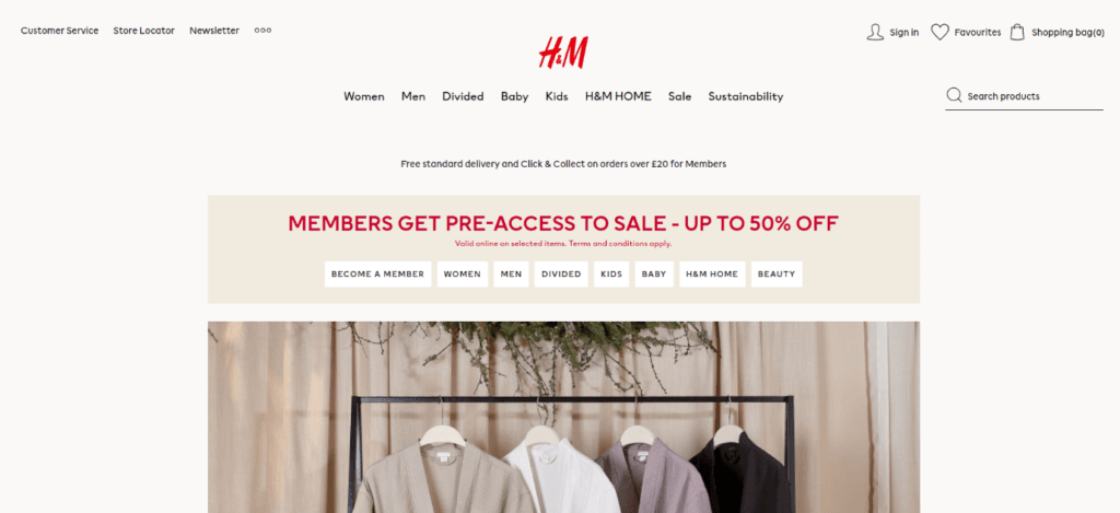
Figure 3: Landing Home page of H&M
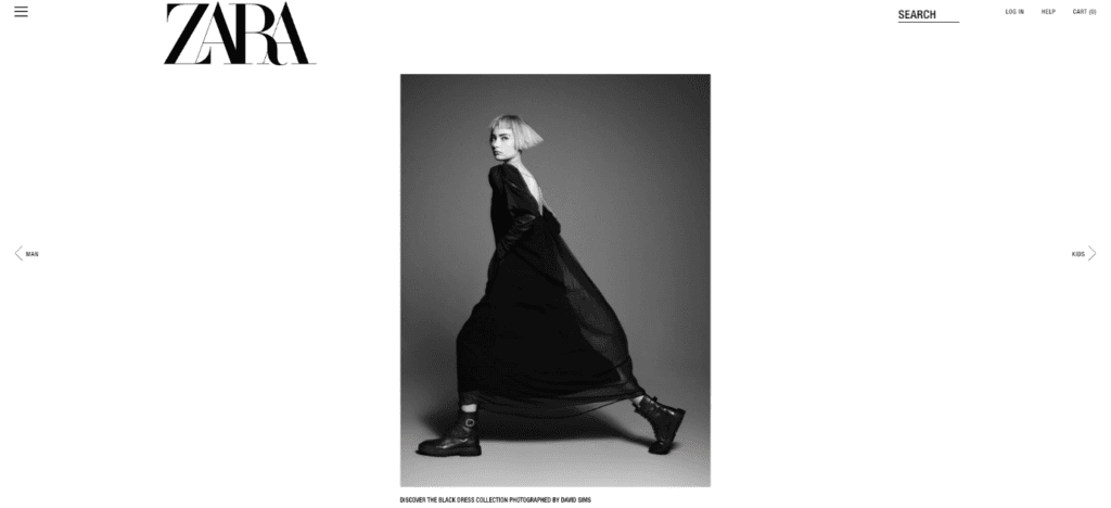
Figure 4: Landing Home page of ZARA
Product Discovery
The product discovery pages of H&M and ZARA also had contrasting differences. The ZARA website made use of a minimal background with very little text and information (Figure 6), whereas the H&M website had a proper heading, a paragraph description of the category, multiple filtering options on the left, and a top bar (Figure 5). The offers and product discounts were mentioned on the product discovery page itself which made the product consideration part easier. No offers or discounts were found on the ZARA website during this investigation.
ZARA does not rely on paid promotions and commercials to attract customers, instead of relies on word of mouth and a strong brand image (LENZI, 2018). The company’s presence in the digital and offline world and the brand value it has created over the years aid the process. ZARA rarely offers discounts on their merchandise. The scarcity of products established by producing a very limited stock of each piece psychologically motivates the buyer to buy it as quickly as possible before it runs out of stock on the ZARA website (Chunling, 2020). The pricing for each product was difficult to read on the ZARA website because of the extremely small font size (Figure 6).
The filtering options were visible on the ZARA website only when the user clicked on the “FILTER” button (Figure 6), whereas on the H&M website, the filtering and sorting options were visible clearly (Figure 5). One drawback of the H&M website’s filtering option was that the option was static on the page and thus if a user wishes to apply the filters, then they always have to go back to the top of the page. Whereas, on the ZARA website, the ‘FILTER’ button was always visible throughout the page at a fixed location doesn’t matter which part of the page you are on (Figure 6).
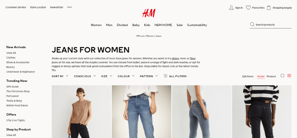
Figure 5: Products page on H&M website
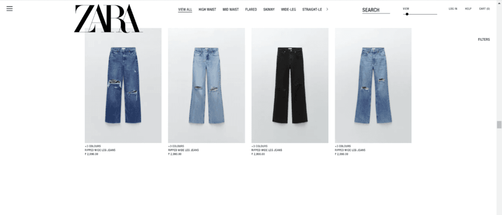
Figure 6: Products page on ZARA website
Comparatively, the website of H&M was offering more flexibility and ease of use for the customers on its website which was making the product discovery and consideration part of the customer journey more effective than the one on the ZARA website.
Product Presentation
The product page on the H&M website offered information related to the product by stressing more on images and less on text. For example, different colors for the same product were visible through small image graphics instead of text (Figure 7), whereas, on the ZARA website the information about the product was very broad with the inclusion of material and product origin (Figure 8). The website of H&M was also offering the user to Wishlist the products if they want to save them for a later purchase, however, no such option was visible on the ZARA website.
A major contrasting difference between the two e-businesses’ websites was that H&M was also offering reviews and ratings for each product which helped customers make a purchasing decision (Lim, 2016), while this feature was absent on the ZARA website.
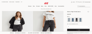
Figure 7: Product Presentation on the H&M website
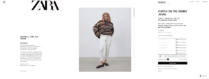
Figure 8: Product presentation on the ZARA website
Cart Management
The cart page of H&M shows the information about the added products in a tabular form with color, size, and price (Figure 9). On the ZARA website, this information was available in the row form (Figure 10). One interesting difference noticed between the two websites was that H&M was showcasing only the jeans image on the product now whereas the ZARA website was still making use of the model’s complete image (Figure 10). Just by looking at the cart image on the ZARA website, it was difficult to tell what product the user had added to the cart. The ZARA website was not offering any similar product recommendations on its cart page and it was coming immediately to an end while scrolling. Whereas, on the H&M website, multiple options of similar recommended products that the user can add were visible on its website (Figure 11).
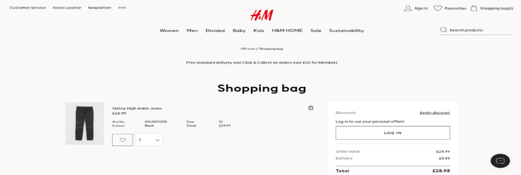
Figure 9: Cart page on the H&M website
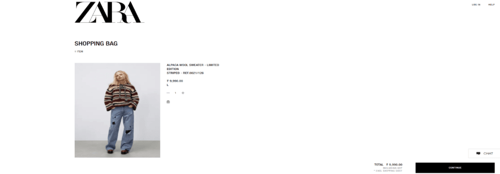
Figure 10: Cart page on the ZARA website
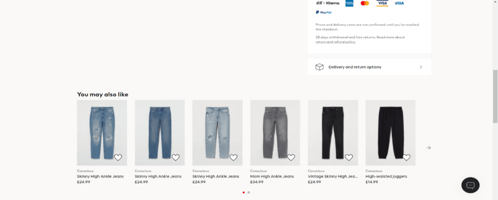
Figure 11: Recommended products on H&M website
Checkout Page
Both websites allowed the users to check as guests without creating an account. Both websites ask the user the same piece of information for creating the account, however, the form UI design (Najjar, 2011) on the checkout page looked more impressive on the ZARA website (Figure 13).
H&M was making the checkout page to its advantage by reiterating the discount and advantage the customer will have by creating the user account, however, no such information was there on the ZARA website.
A major difference on the checkout page of the website was support. H&M website was allowing the user the option of interacting with the chatbot (Figure 12) by clicking on the chat icon on the left bottom of the screen, however, on the ZARA website this or any support option was unavailable (Figure 13).
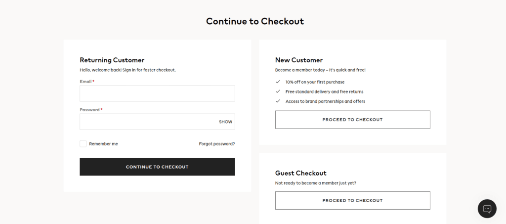
Figure 12: Checkout page on H&M website
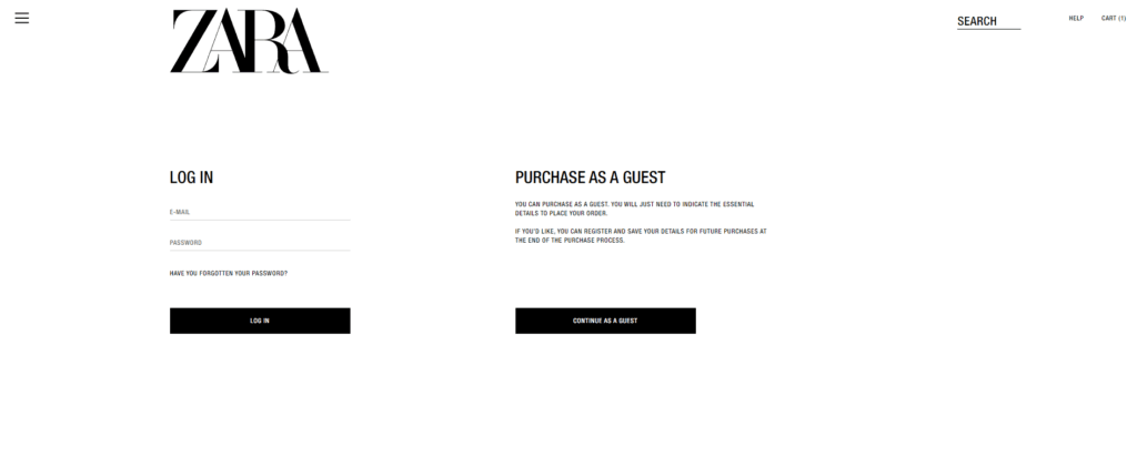
Figure 13: Checkout page on ZARA website
Proposed e-business
A new e-business in apparel and fast fashion is proposed which includes the best features of both the e-commerce website – H&M and ZARA that have been compared and analyzed for the customer journey in this report thoroughly.
The proposed e-business should make use of both organic SEO and paid marketing tools to appear in the search results. It should also create brand awareness by using both online and offline mediums and through strategic partnerships with models and celebrities.
The landing page design should automatically detect the location of a user like ZARA by asking permission through the web browser. The landing page design should be minimalistic like ZARA and not confusing with hundreds of colors and fonts, however, the navigation and structure should be easy to understand like the one on the H&M website.
Pricing and other details which are important parts of a customer’s purchasing decision should be clearly stated on a website like H&M. The filter button should be dynamic as the one on the ZARA website and should not be fixed on the top.
The product page should properly present the high-definition images of the product with ample information like the material used in making just like the ZARA website. The website should also graphically showcase other available colors instead of text and most importantly, the e-business should have the option of adding products to the wish list to save them for future purchases, just like the H&M website.
The cart page should be inspired by H&M and information like color, size, quantity, and price should be mentioned in tabular form. E-commerce should also show only relevant images of the product. For example, if the person is shopping for a pair of jeans, then only those particular jeans should be visible on the cart page and not the model’s complete image.
The cart page should also recommend similar products that the customer may consider apart from the current purchase.
The checkout page should allow the customers to continue as guests. The design of the page should be minimalistic like ZARA and not crowded so that customers feel that they have to feel a bulk of information. However, the offers and reasons to create an account and how the customers can benefit from it should be properly mentioned like the H&M website. A major feature that must be incorporated from the H&M website is support and chatbot which can help customers with their generic queries.
Research Limitations and Future Recommendations
The limited data set is one of the study’s significant flaws. The results cannot be believed to be accurate because they were based on the purchase of a single product from one location by just one customer. Using larger and more diversified data sets, such as many locations, products, and personas, this discrepancy can be minimized.
Conclusion
A detailed analysis of the customer journey at different stages has been made thoroughly in this report for the two e-businesses: H&M and ZARA. Both websites differ in their structure, design, and approach to a large extent despite selling similar products. It is difficult to analyze both websites with one parameter because the customer segment that they target is also different. Thus, it is not possible to say which website is the clear winner. However, based on the different stages of the customer journey, a comparison has been made using one hypothetical persona for both websites. As part of the research, an e-business with the best features from the H&M and ZARA website has also been proposed. The proposed e-business has been made to minimize the negative aspects of the e-businesses selected for comparison and to improve the customer experience and journey. The limitations of the report and future recommendations have also been made to complete the report.
References
Mangiaracina, R. and Brugnoli, G., 2008. The e-commerce customer journey: a model to assess and compare the user experience of the e-commerce websites. The Journal of Internet Banking and Commerce, 14(3), pp.1-11.
Abdel-Jaber, H., 2021. The Devil Wears Zara: Why the Lanham Act Must Be Amended in the Era of Fast Fashion. Ohio St. Bus. LJ, 15, p.234.
Sheikh Salman, N., 2018. Analyzing of H&M Brand, H&M Home.
Chen, H.Y., 2021. THE EFFECT OF FAST FASHION BRAND AWARENESS ON PURCHASE INTENTION: A STUDY OF FASHION CLOTHING. International Journal of Organizational Innovation, 14(2).
Lewandowski, D., S nkler, S. and Yagci, N., 2021, June. The influence of search engine optimization on Google’s results: A multi-dimensional approach for detecting SEO. In 13th ACM Web Science Conference 2021 (pp. 12-20).
Kim, Y. and Oh, K.W., 2020. Which consumer associations can build a sustainable fashion brand image? Evidence from fast fashion brands. Sustainability, 12(5), p.1703.
Ning, Z.E., 2021. List price and discount in a stochastic selling process. Marketing Science, 40(2), pp.366-387.
LENZI, F.R., 2018. FAST FASHION: THE GLOBALIZATION OF DRESSING IN POSTMODERNITY AND THE INDITEX (ZARA) CASE STUDY FRANCESCA R. LENZI. Fashion through History: Costumes, Symbols, Communication (Volume II), 2, p.306.
Chunling, L., 2020. Analysis of the Marketing Strategy of Fast Fashion Brand Zara Based on 4c Theory.
Lim, Y.J., Osman, A., Salahuddin, S.N., Romle, A.R. and Abdullah, S., 2016. Factors influencing online shopping behavior: the mediating role of purchase intention. Procedia economics and finance, 35, pp.401-410.
Najjar, L.J., 2011, July. Advances in e-commerce user interface design. In Symposium on Human Interface (pp. 292-300). Springer, Berlin, Heidelberg.


